
In my view, Bitcoin retention patterns signal a quiet reset rather than a crash.#Bitcoin #onchain
Quick Video Breakdown: This Blog Article
This video clearly explains this blog article.
Even if you don’t have time to read the text, you can quickly grasp the key points through this video. Please check it out!
If you find this video helpful, please follow the YouTube channel “BlockChainBulletin,” which delivers daily Crypto news.
https://www.youtube.com/@BlockChainBulletins
Read this article in your native language (10+ supported) 👉
[Read in your language]
Bitcoin Long-Term Holders Just Stopped Selling, But a Broken Chart Signal Hides the Truth
Jon: Hey Lila, I came across this intriguing piece from CryptoSlate about Bitcoin’s long-term holders. The title says it all: they’ve apparently stopped selling, which sounds like a bullish signal, but there’s a catch with a “broken” chart indicator that’s misleading some folks. It’s based on recent on-chain data as we head into 2026.
Lila: Oh, interesting. I’ve been following Bitcoin’s ups and downs, especially after that wild 2025. So, long-term holders are those who’ve held BTC for over a year, right? And they’ve halted their selling? That could mean the market’s stabilizing.
Jon: Spot on. According to the analysis, metrics like the Long-Term Holder (LTH) Spent Output Profit Ratio (SOPR) and whale activity show that these holders—who control a significant chunk of Bitcoin’s supply—have indeed paused their sell-offs. This comes after a period of distribution where they were cashing out profits. But here’s the twist: a popular chart signal, something like the Hash Ribbon or a moving average crossover, is flashing what looks like a buy signal, but it’s “broken” because it’s not accounting for phantom wallet movements or shifted strategies by smart money.
Lila: Phantom wallet movements? That sounds spooky. Why does this matter?
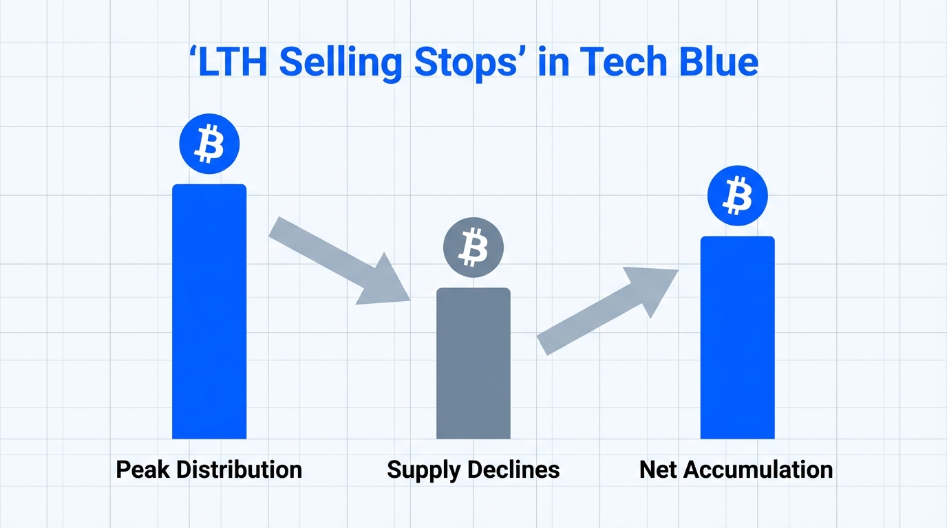
Jon: It matters because in crypto, especially with Bitcoin, understanding holder behavior can give clues about market cycles. Long-term holders stopping sales often precedes price recoveries, as it reduces selling pressure. But if panic sellers are reacting to false signals—like misinterpreting large transfers that aren’t actual sales—it could lead to unnecessary volatility. Think of it as the market’s pulse: a steady beat from LTHs is good, but a glitchy monitor (that broken chart) might scare people off prematurely. As we enter 2026, with Bitcoin hovering around $85,000 to $90,000 after a 30% pullback from its all-time high, this could signal a reset rather than a crash.
Lila: Got it. So it’s not all sunshine—there’s nuance here.
Jon: Exactly. Let’s dive deeper into why this “broken” signal is causing confusion.
Lila: Alright, what’s the core problem here? It seems like people are misreading the data.
Jon: The problem boils down to on-chain analysis pitfalls. Long-term holders have indeed reduced selling, with data showing a drop in coins moved from old wallets—say, those dormant for 155 days or more. But a chart signal, perhaps tied to the Puell Multiple or realized price bands, is “broken” because it’s picking up noise from things like ETF inflows or institutional reshuffling, not genuine capitulation. This hides the truth that smart money is accumulating quietly, while retail panics.
Lila: Can you break that down? What’s causing this misinterpretation?
Jon: Sure. Imagine Bitcoin’s market as a busy highway. Long-term holders are like truckers who’ve been hauling cargo (BTC) for miles—they don’t swerve easily. When they stop unloading (selling), traffic eases up, potentially allowing speeds (prices) to pick up. But if there’s a faulty traffic light (the broken chart signal) flashing red due to unrelated construction (phantom transfers from exchanges or whales consolidating wallets), drivers (investors) slam on the brakes unnecessarily. In reality, the road ahead might be clear, supported by metrics like renewed spot ETF inflows and whale accumulation as per recent reports.
Lila: Haha, love the highway analogy—it makes sense. So the “broken” part is like a glitch in the system that’s not reflecting the actual flow.
Jon: Precisely. This glitch comes from over-relying on single indicators without cross-verifying with broader data, like the Bitcoin whale ratio or liquidity trends heading into 2026.
Under the Hood: How it Works
Jon: Okay, let’s get technical but keep it approachable. Under the hood, Bitcoin’s holder behavior is tracked via on-chain analytics—data directly from the blockchain. Tools like Glassnode or CryptoQuant monitor metrics such as the Long-Term Holder Supply, which is the amount of BTC held for over a year, currently around 75% of total supply. When these holders stop selling, it’s often measured by the LTH-MVRV ratio (Market Value to Realized Value), which compares current prices to the average cost basis of these holders.
Lila: MVRV? That’s the one where if it’s above 1, holders are in profit, right?
Jon: Yes, and right now, it’s dipping but not crashing, suggesting no mass exodus. The “broken” chart signal might refer to something like the 200-day moving average failing to act as support due to external factors, like ETF redemptions mimicking sales. But digging deeper, on-chain shows whales (addresses with over 1,000 BTC) easing up on distributions, shifting to accumulation amid 2026 liquidity thins.
Lila: So it’s about distinguishing real selling from noise. Any way to compare these signals?
Jon: Absolutely. Let’s look at a quick comparison of healthy vs. misleading signals.
| Metric | Healthy Signal (True LTH Pause) | Misleading Signal (Broken Chart) |
|---|---|---|
| LTH Selling Activity | Decreasing volume of old coins moved, indicating accumulation. | Spikes from wallet consolidations or ETF flows, mimicking sales. |
| Price Implication | Reduced supply pressure, potential for rally if demand holds. | Panic selling from false alarms, leading to temporary dips. |
| Example Indicator | LTH SOPR below 1, showing profit-taking halt. | Hash Ribbon “buy” signal ignored due to macro noise like copper-gold ratios. |
| 2026 Outlook | Bullish if institutional sentiment shifts positive. | Bearish risks if unverified signals cause overreactions. |
Lila: That table clarifies a lot. It’s like having a cheat sheet for not getting fooled by the charts.
Jon: Glad it helps. Remember, these are tools, not crystal balls—always cross-reference with multiple sources.
Lila: So who actually uses this kind of analysis? Is it just traders, or does it have broader applications?
Jon: Great question. On-chain analysis like this is used by a range of folks. Developers building DeFi protocols might track LTH behavior to gauge network health for things like lending platforms, ensuring liquidity isn’t drying up. Institutional investors, such as those managing Bitcoin ETFs, use it to time entries without hype—focusing on data-driven decisions. Even researchers in Web3 study these patterns to understand tokenomics in broader ecosystems, like how holder distribution affects decentralization. The technical benefit is clear: it provides transparency into Bitcoin’s proof-of-work consensus, helping predict supply shocks without relying on centralized reports.
Lila: And for everyday users? Could this help someone learning about crypto?
Jon: Absolutely. Users can apply it to assess if Bitcoin’s market is maturing, perhaps for integrating BTC into payment systems or wallets. It’s about understanding mechanics, like how reduced selling from LTHs could stabilize volatility for real-world adoption in remittances or store-of-value scenarios. No get-rich schemes here—just solid insights into blockchain dynamics.
Jon: If you’re interested in exploring this further, let’s talk about an educational action plan. Start with Level 1: Research and observation. Dive into free resources like the Bitcoin whitepaper on bitcoin.org or on-chain dashboards from Glassnode and CoinMetrics. Learn to read metrics like LTH supply—it’s like checking a car’s dashboard before a drive. Watch how these change over time without committing any funds.
Lila: Sounds safe. What about getting hands-on without risks?
Jon: That’s Level 2: Testnet experimentation. Bitcoin has testnets where you can simulate transactions using fake BTC. Tools like the Bitcoin Testnet Explorer let you practice tracking wallet movements or even run a node with software like Bitcoin Core in test mode. It’s a way to understand on-chain data flows safely—experiment with minimal setups on your computer to see how holder metrics work in a controlled environment. Remember, this is for learning the tech, not speculating.
Lila: Perfect for beginners building confidence.
Jon: Wrapping up, this shift in long-term holder behavior points to a potential market reset for 2026, with opportunities for deeper understanding of Bitcoin’s resilience. But limitations abound—macro factors like regulatory changes or economic shifts could override these signals. It’s worth watching how whales and institutions adapt.
Lila: Totally agree. Crypto’s volatile, and no one can predict the future. Always approach with caution and focus on education over speculation.
Jon: Well said. Let’s keep an eye on those charts—responsibly.
References
- Bitcoin long-term holders just stopped selling, but a broken chart signal hides the truth
- Official Bitcoin Website
- Bitcoin Price Prediction For 2026: New Peak Or Breakdown? (BeInCrypto)
- Four Bitcoin charts to watch heading into 2026 (TradingView)